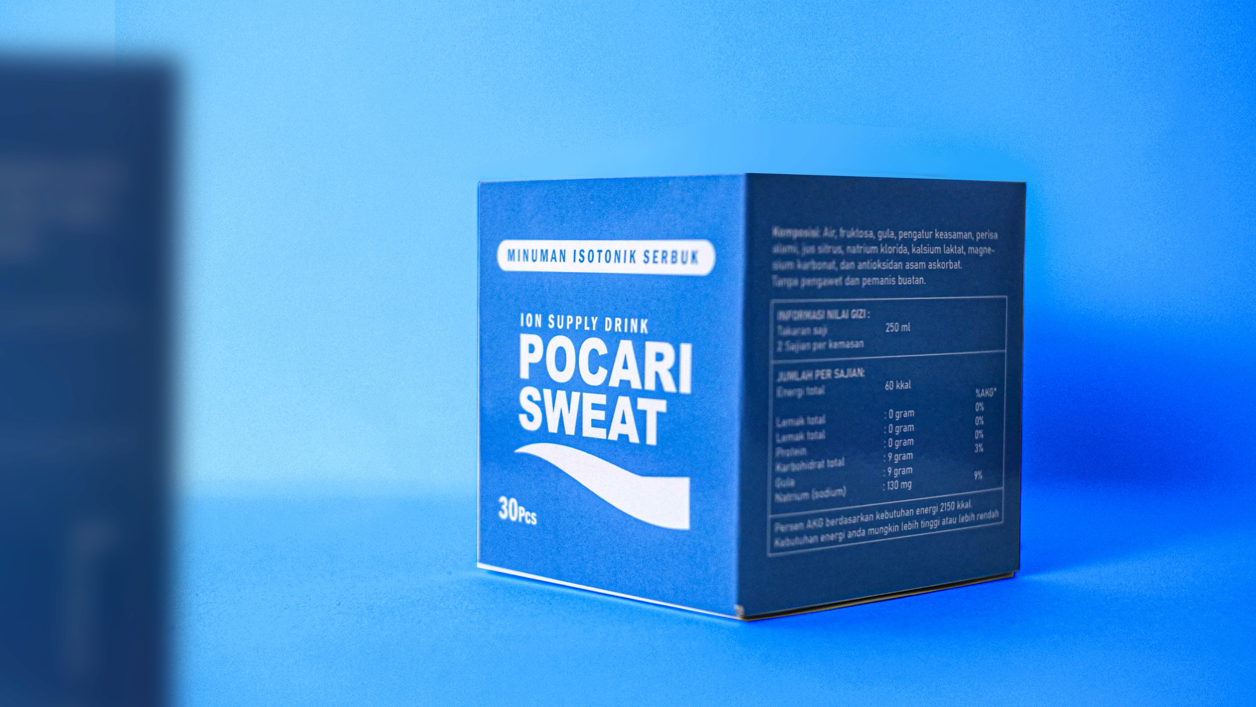
From Hydration to Brand Experience
Pocari Sweat Dehydration Concept branding & packaging
During Asia’s scorching summer, dehydration becomes a major challenge. Through Pocari Sweat’s packaging campaign, we introduced refreshing Asian inspired characters that embody energy and vitality, turning the design into both a visual attraction and a reminder of the importance of staying hydrated.
about the project
the client
Pocari Sweat is a hydration drink designed to replenish lost body fluids and electrolytes, making it an essential companion during Asia’s hot summers. With its light and refreshing taste and clear brand identity, Pocari Sweat has become a symbol of energy, health and balance, helping people stay active, refreshed and hydrated in their daily lives
the challange
Asia’s intense summer heat often leads to dehydration, affecting energy levels and daily activities. The challenge was to create a packaging campaign for Pocari Sweat that not only attracts attention but also communicates the importance of staying hydrated. We needed a fresh, relatable visual approach that resonates with Asian audiences while reinforcing Pocari Sweat’s role as the go-to hydration solution.
the SOLUTIONS
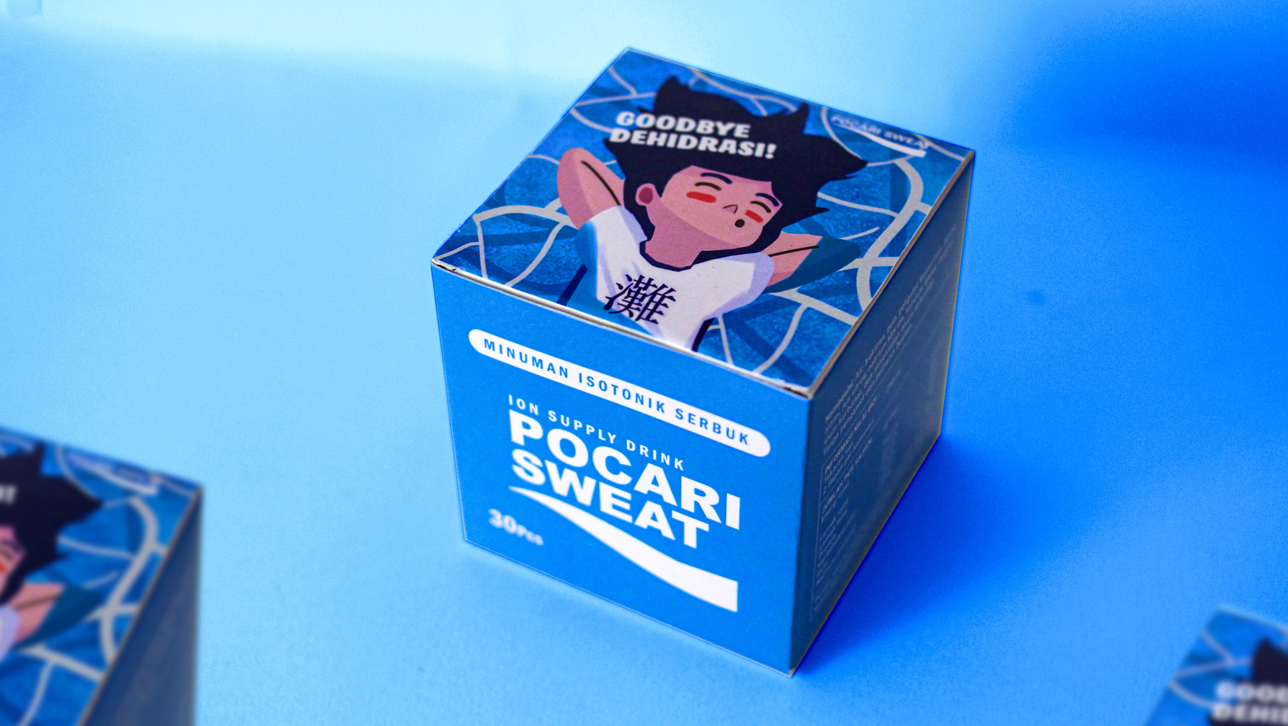
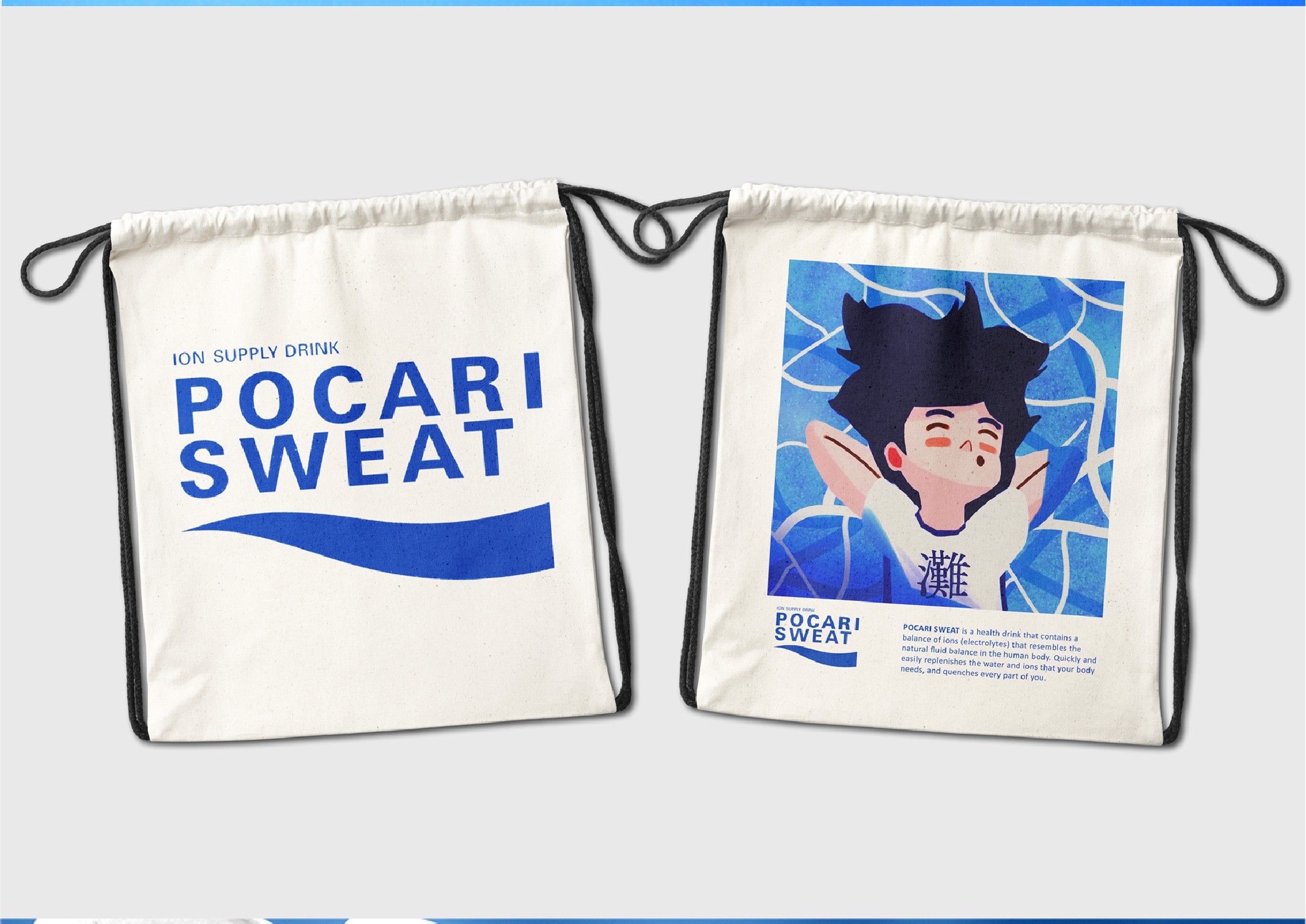
To address this challenge, we designed a packaging campaign featuring refreshing Asian-inspired characters that embody energy and vitality. The illustrations bring a sense of freshness and cultural relevance, making the product visually engaging while reinforcing Pocari Sweat’s message of proper hydration. This approach transforms the packaging into both a functional product and a storytelling medium that connects emotionally with consumers
Local Relevance
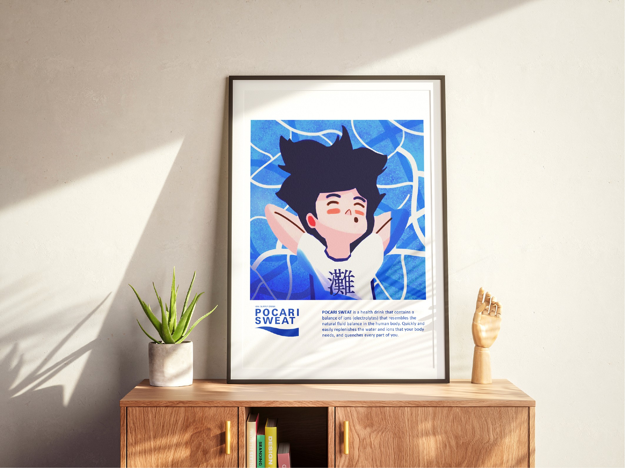
For the illustration style, I chose an Asian-inspired approach to make it more relatable for local audiences. I also added Japanese characters on the packaging to enhance familiarity and ensure easier understanding for consumers.
Visualizing Hydration
The concept began with a brainstorming process to capture the essence of hydration. Since dehydration relates to the loss of body fluids and the feeling of thirst, I aimed to influence the emotions of potential customers who experience heat and dryness. To visualize this, I created a refreshing illustration of a child swimming and enjoying the cool, fresh air in a calm and relaxed way.
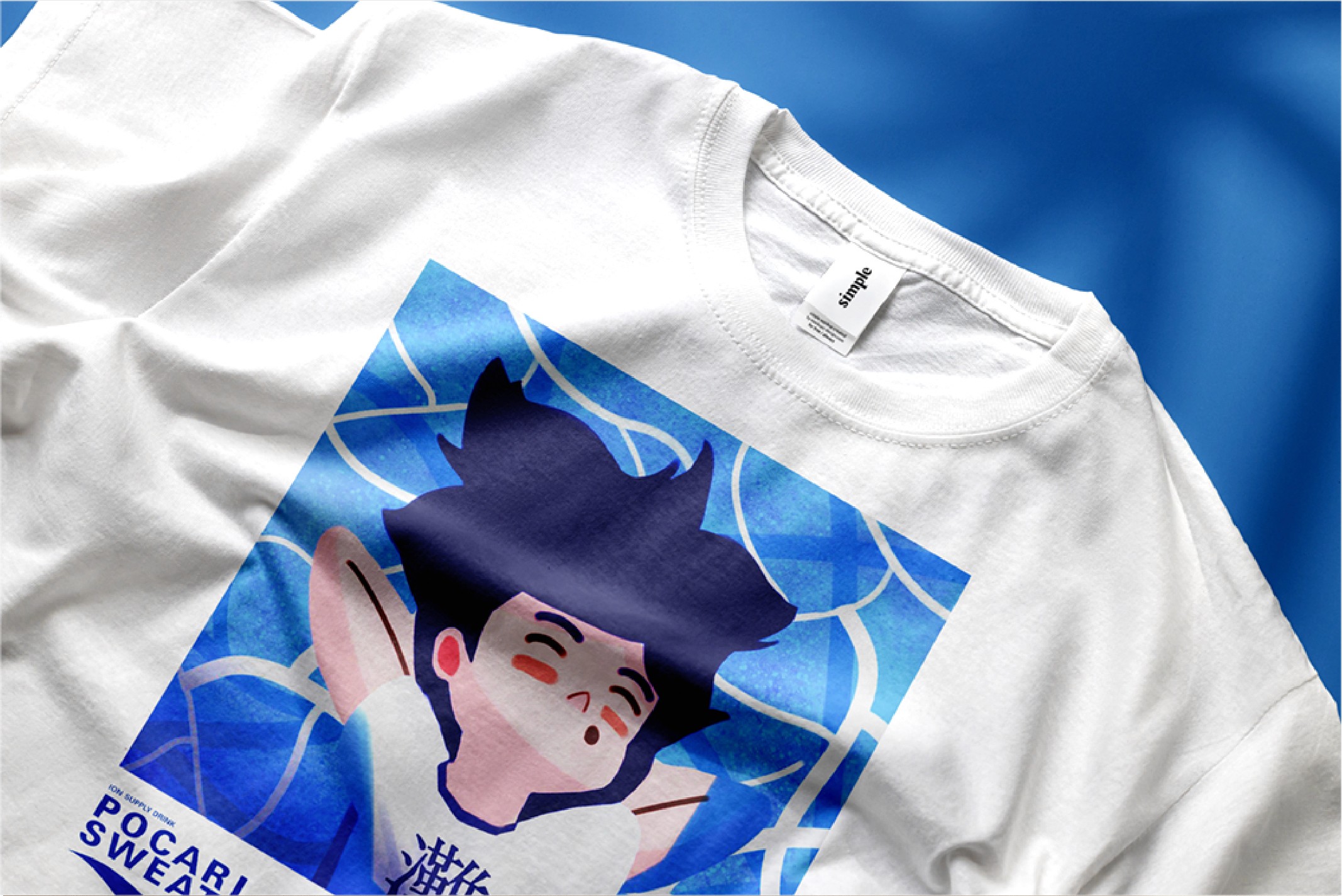
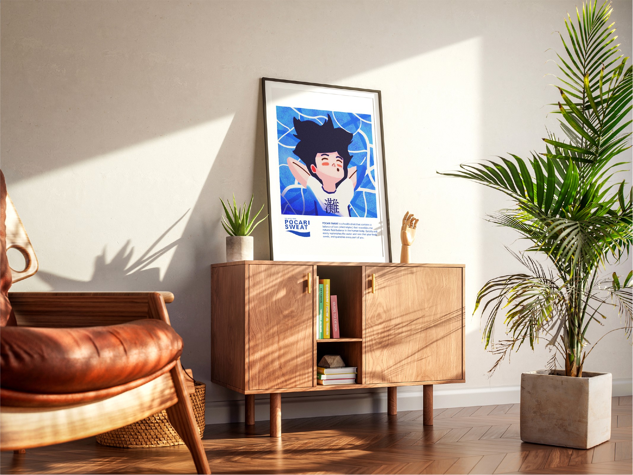
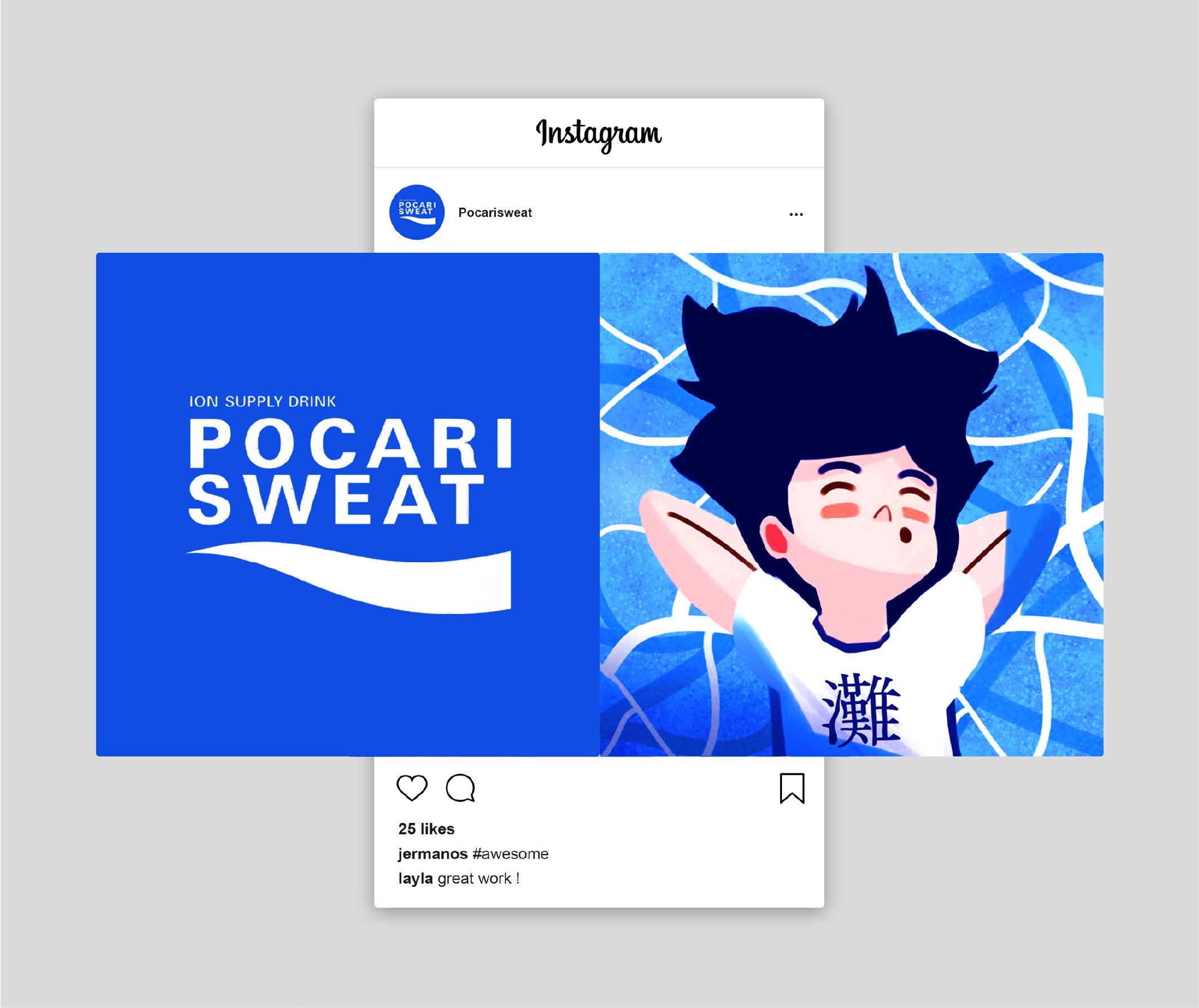
“This project was truly exciting. We spent countless sessions brainstorming and curating ideas, pushing our creativity to new heights. The most enjoyable part was the chance to design the packaging itself, which made the process even more rewarding. Even though our desks were covered with paper cutouts, glue marks, and scattered ink, the messy process felt incredibly fun. We also had the opportunity to design the product photography layout, adding another layer of creativity to the project.”
“
baruna kh.s
branding & graphic designer

other project
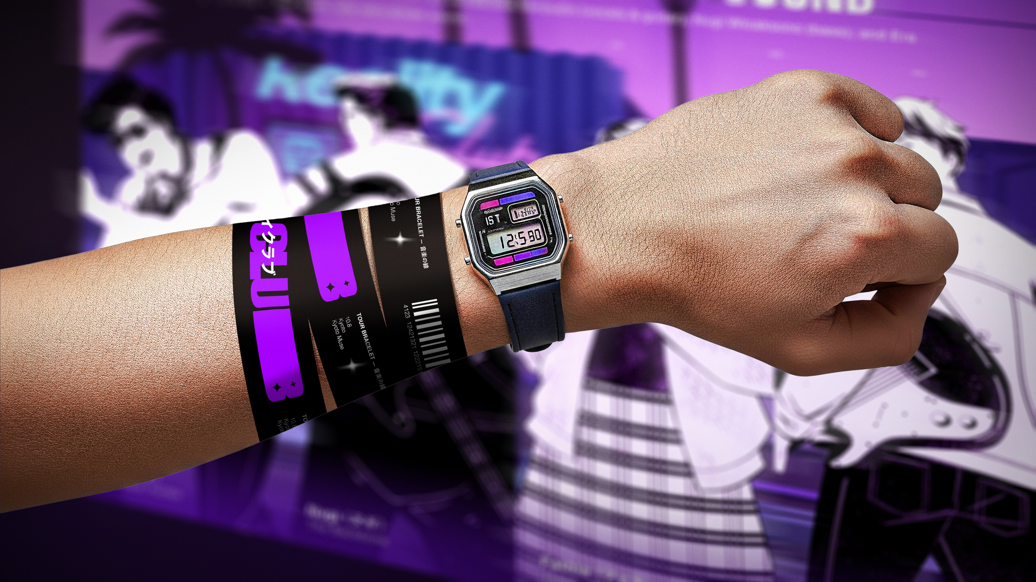
Branding that sold out tickets in days.
REALITY CLUB : SUMMER ON THE ORIENT, TOUR VISUAL IDENTITY
BRANDING VISUAL IDENTITY, SOCIAL MEDIA DESIGN, MERCHANDISE design
Boost Social Impact with Visual Identity
COMMUNITY ENGAGEMENT PROGRAM 2023, EVENT VISUAL IDENTITY
BRANDING VISUAL IDENTITY, CAMPAIGN Poster Design, Social Media Design, Banner EVENT DESIGN