© 2025 BARUNA KHS. All Rights Reserved.
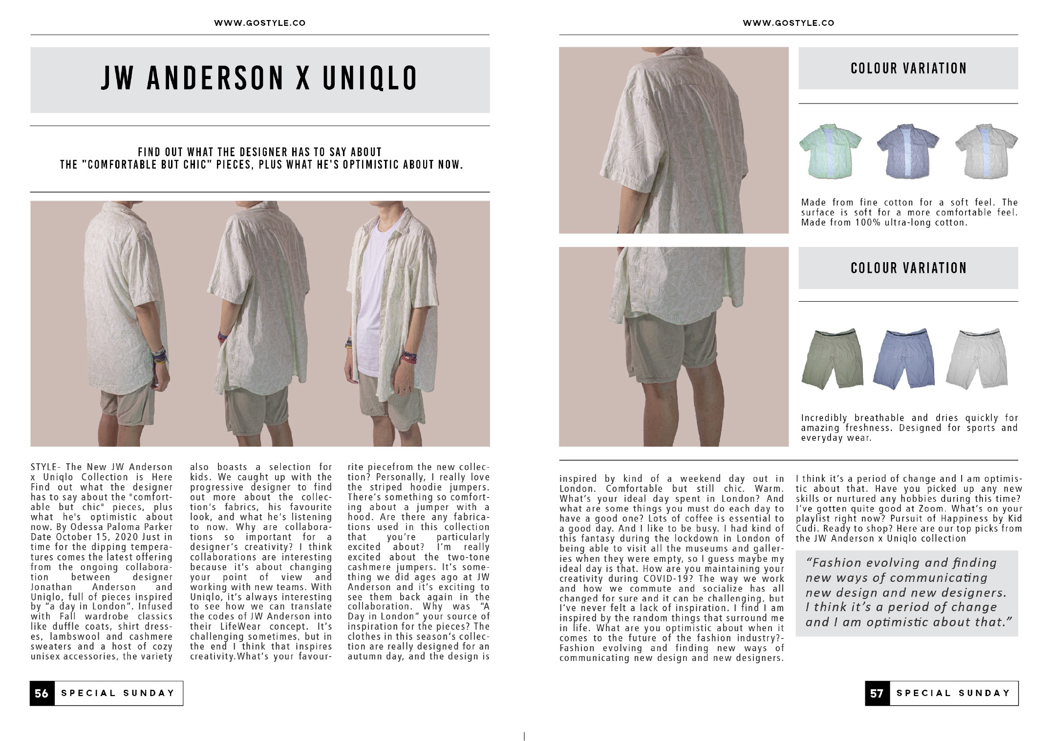
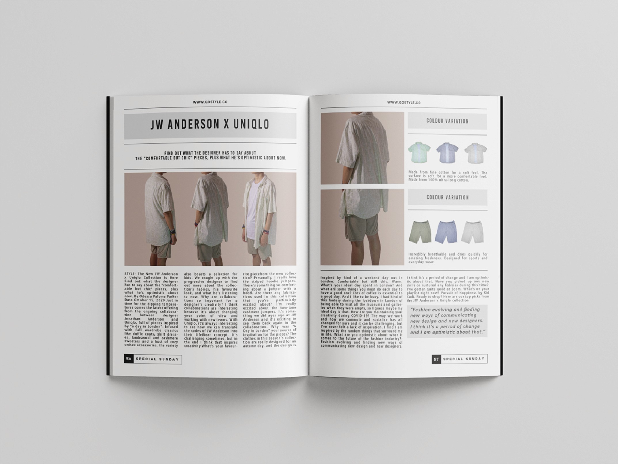
Designing this editorial layout was more than arranging text and images. It was about crafting an experience where every page could inspire, guide, and connect readers with the essence of style.
“
baruna kh.s
branding & graphic designer

about the project
Go Style is a contemporary fashion magazine publisher that showcases the latest trends, lifestyle insights, and creative expressions for a young, style-conscious audience. As a platform that highlights both local and international fashion, Go Style is committed to delivering not just information but also visual inspiration through striking editorial layouts and photography.
the client
the solution
The main challenge was how to design an editorial layout that not only reflected Go Style’s modern, trend-driven image but also maintained clarity and readability. Fashion magazines often struggle to balance bold visuals with structured content, and the task required ensuring the design could capture attention while still guiding readers smoothly through the articles.
the problem
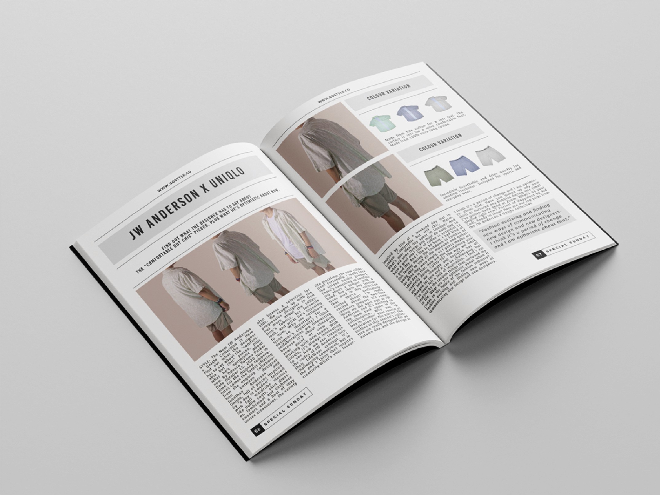
I developed a clean yet dynamic editorial layout concept that integrated modern typography, asymmetrical grids, and ample white space to create a balance between bold visuals and editorial clarity. A cohesive visual hierarchy was applied, allowing images to shine while ensuring the written content remained accessible. This approach elevated the magazine’s style identity, making the reading experience more engaging and visually appealing.
Editorial Layout that Elevates Style
Fashion Magazine Layout, Visual Concept
I designed an editorial layout for a fashion magazine with the goal of elevating its visual storytelling and style. The challenge was to balance modern aesthetics with readability, ensuring the content remained engaging without compromising clarity. By combining clean typography, bold imagery, and structured grid systems, I created a layout that feels stylish, cohesive, and visually impactful.

Cultural Motifs
For the pattern design, I drew inspiration from the leaves of a prominent Asian plant, incorporating subtle abstract motifs to make the design more visually appealing and dynamic. The color palette focused on blue and red, colors commonly found in traditional Asian batik, which helped reinforce cultural relevance while giving the packaging a vibrant and youthful look suitable for teenagers.
other project
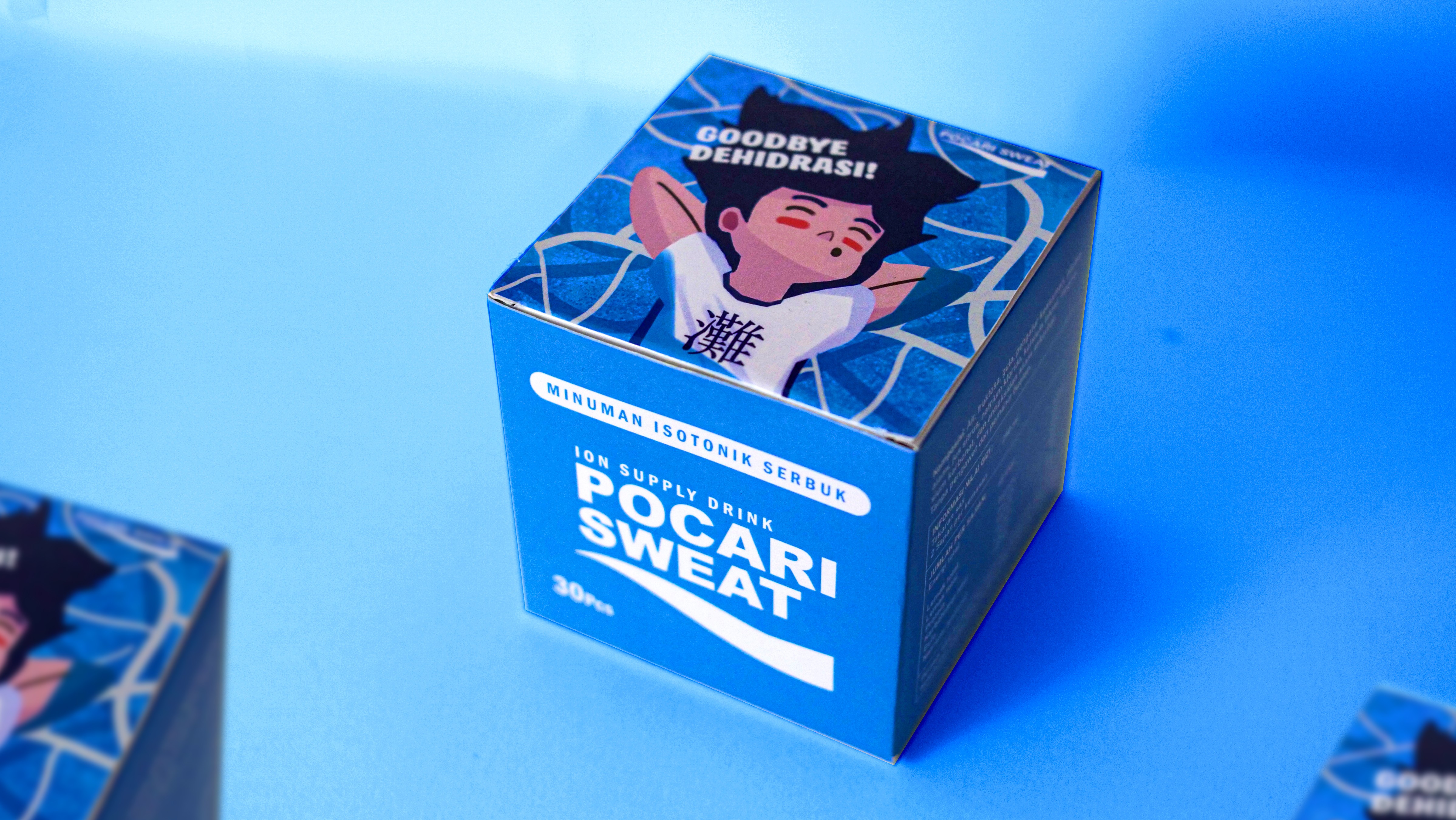
from hydration to brand experience
POCARI SWEAT DEHYDRATION CONCEPT BRADNING & PACKAGING
BRANDING VISUAL IDENTITY, MERCHANDISE DESIGN, ADVERTISING VISUAL POSTER, PACKAGING DESIGN
Boost Social Impact with Visual Identity
COMMUNITY ENGAGEMENT PROGRAM 2023, EVENT VISUAL IDENTITY
BRANDING VISUAL IDENTITY, CAMPAIGN Poster Design, Social Media Design, Banner EVENT DESIGN