© 2025 BARUNA KHS. All Rights Reserved.
about the project
SilverQueen is a leading chocolate brand in the Asian market, known for its premium quality and unique taste. The brand often seeks innovative ways to connect with its audience, especially younger consumers, by creating special edition products that celebrate culture and exclusivity.
the client
the solution
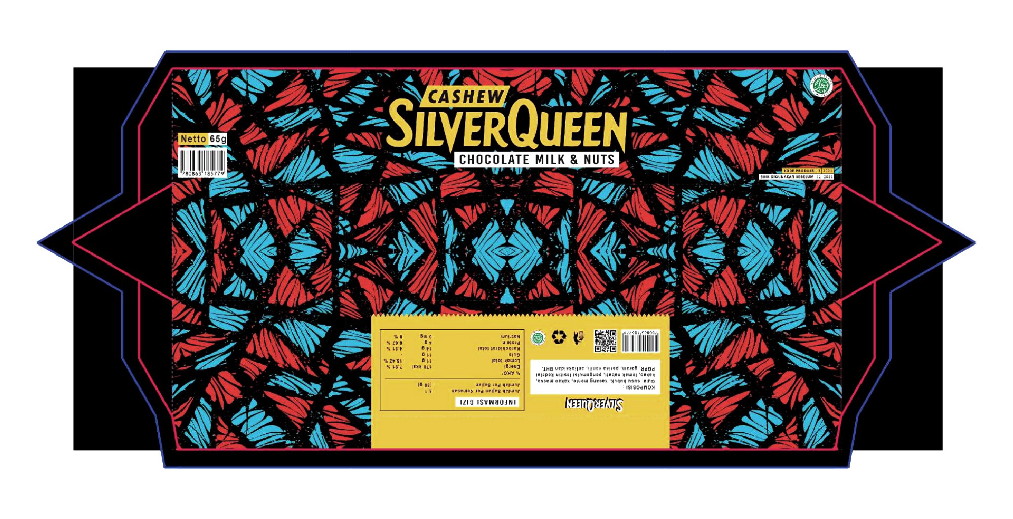
The challenge was to design a special edition packaging that would feel exclusive, culturally relevant, and visually appealing to teenagers across Asia. The design needed to balance playful, youthful elements with authentic cultural references, while ensuring the product stood out in a competitive market filled with vibrant and creative packaging options.
the problem
To address this, I created patterns inspired by Asian plants, combining playful and youthful motifs that resonate with the target audience. Research, sketching, and iterative digital design ensured the final packaging was visually engaging and culturally meaningful.
Working on this campaign was exciting and inspiring. Exploring Asian cultural elements and translating them into a vibrant, teen-friendly packaging allowed me to push creative boundaries while delivering a design that connects with the audience.
“
baruna kh.s
branding & graphic designer

Brand Exclusivity Through Culture
SilverQueen Special Edition Asian Cultural, branding & packaging
how to make the event feel familiar and easily understood by local residents in a regional area. To solve this, I designed a visual identity that combined elements familiar to the community with modern design touches, ensuring the message was clear while also inspiring people in rural areas to move forward together.
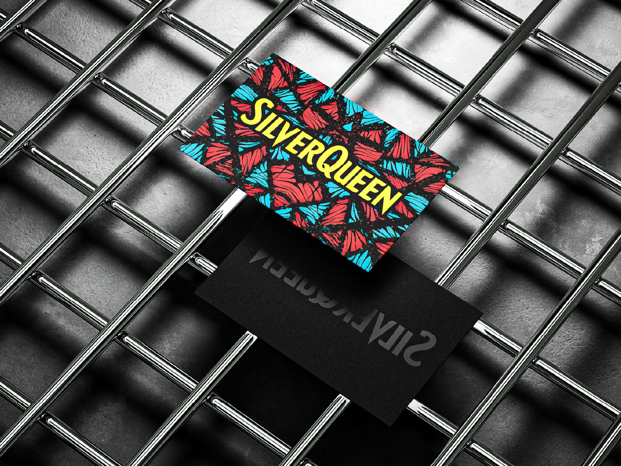
Cultural Motifs
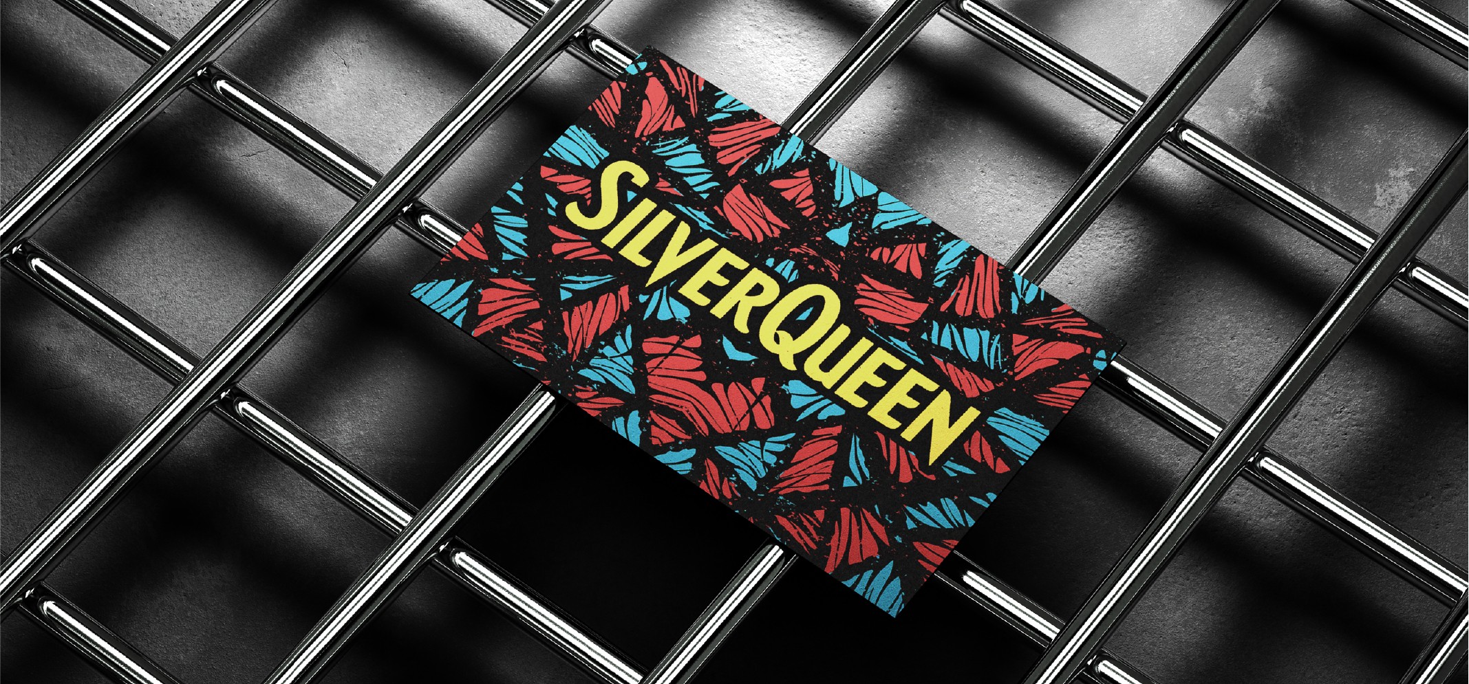
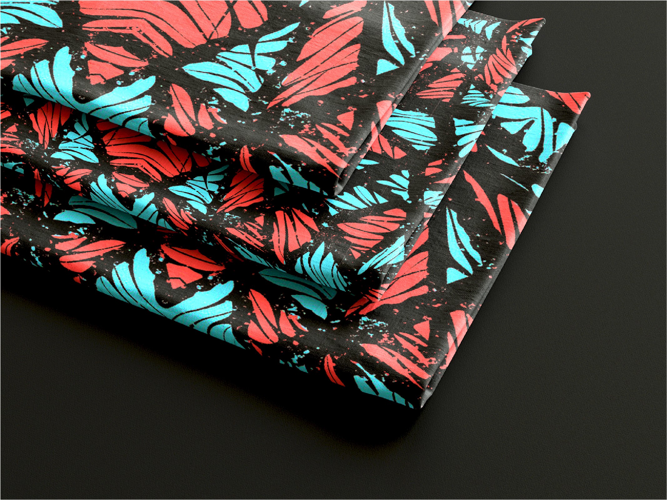
For the pattern design, I drew inspiration from the leaves of a prominent Asian plant, incorporating subtle abstract motifs to make the design more visually appealing and dynamic. The color palette focused on blue and red, colors commonly found in traditional Asian batik, which helped reinforce cultural relevance while giving the packaging a vibrant and youthful look suitable for teenagers.
Adapting the Pattern
The pattern design was created with flexibility in mind so it could be applied across various media. One of the most challenging applications was screen printing on fabric, as overly small or intricate details could easily break or lose clarity during the process. To overcome this, I carefully balanced the level of detail, ensuring the pattern remained visually appealing while still practical and durable for different production methods.


other project
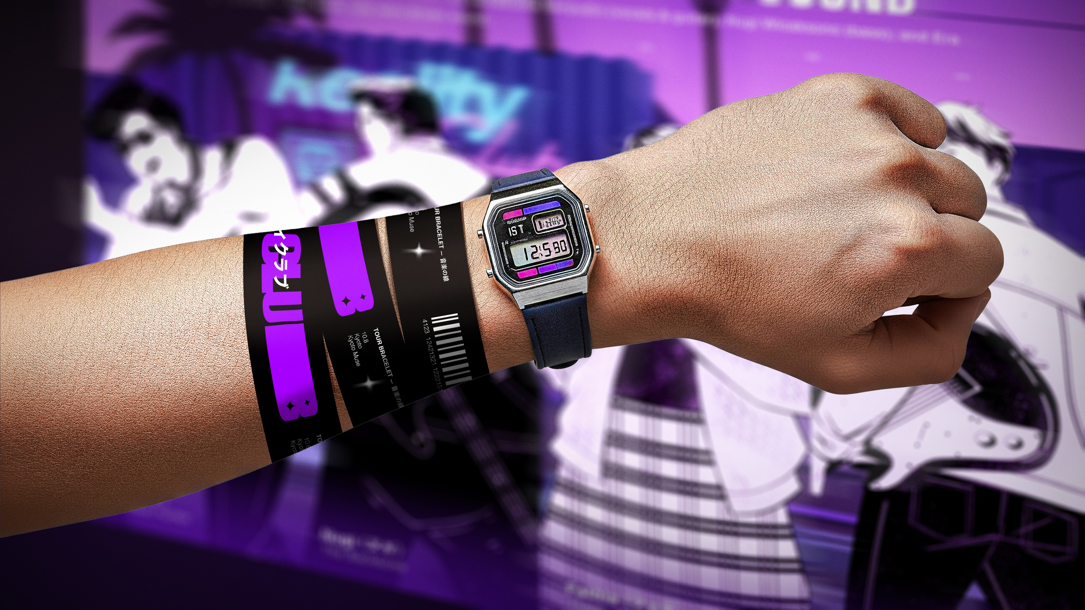
Branding that sold out tickets in days.
REALITY CLUB : SUMMER ON THE ORIENT, TOUR VISUAL IDENTITY
BRANDING VISUAL IDENTITY, SOCIAL MEDIA DESIGN, MERCHANDISE design
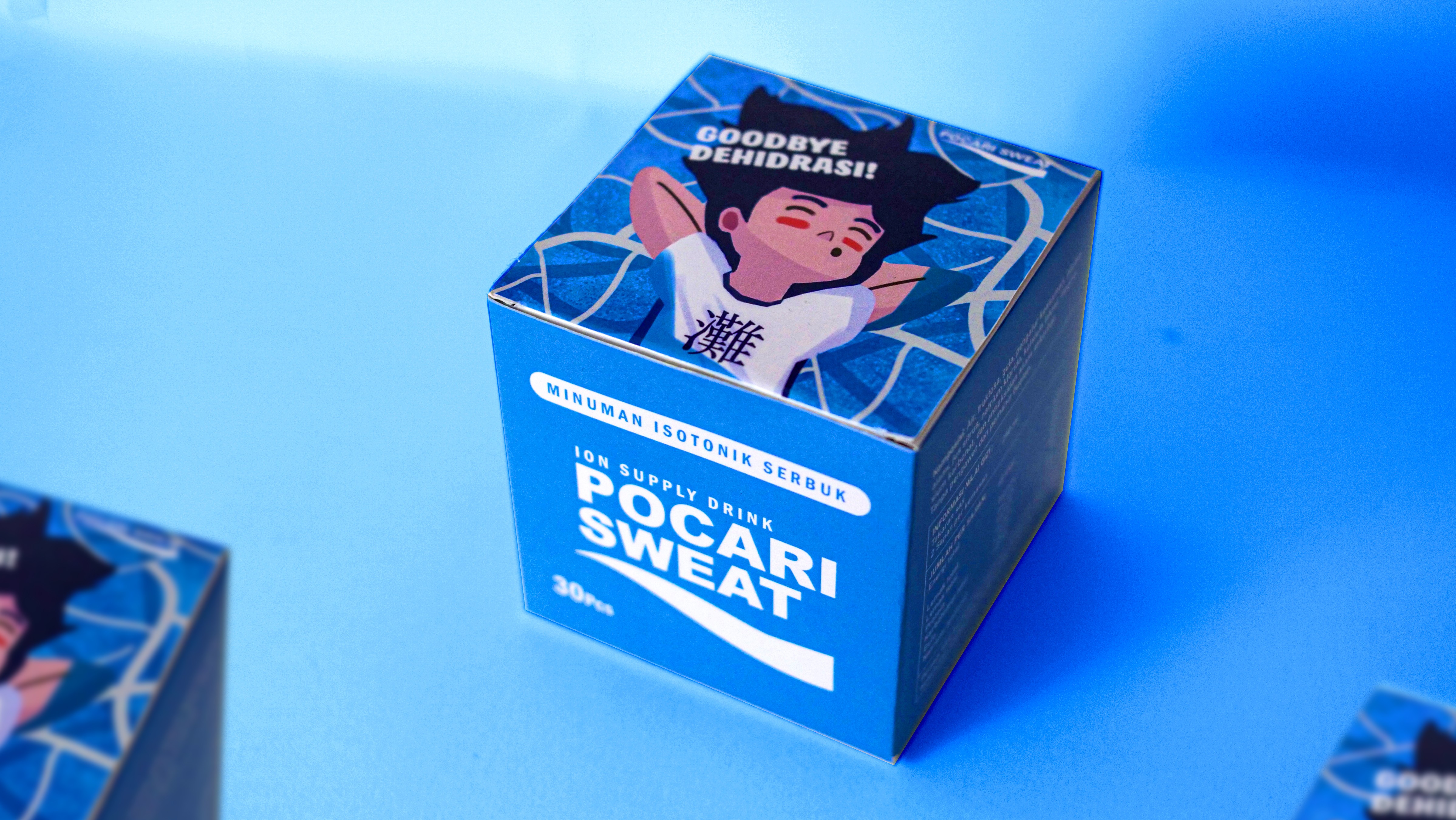
from hydration to brand experience
POCARI SWEAT DEHYDRATION CONCEPT BRADNING & PACKAGING
BRANDING VISUAL IDENTITY, MERCHANDISE DESIGN, ADVERTISING VISUAL POSTER, PACKAGING DESIGN